|
Elements of the Parameter Toolbar during command execution |
Scroll |
|
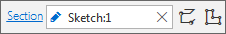
Field to register the selected object. Unavailable for manual input. After selecting an object, its name is entered into the field, and in the right part of this field, the For some objects, such as sketches or contours, the If the object is lost or contains errors, the field has a red background. |


|
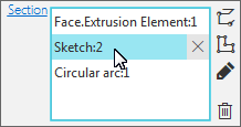
The field for registration of one or several selected objects. Unavailable for manual input. After selecting objects, their names are entered into the field in the form of a list. Next to the field, there may be buttons that control how the recorder is filled. Use one of the following ways to delete a selected object. •Hover the mouse pointer over the object or select it, and then click the •Select the object and click Delete You can edit some objects, such as sketches or contours, without completing the current command. When you select a row of such an object, the Edit If the object is lost or contains errors, its row has a red background. |


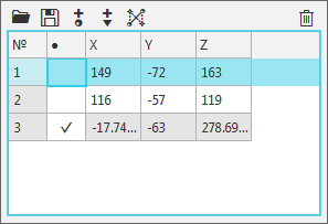
Table
|
A table to register the selected objects and display their parameters. Table cells containing parameter values are available for manual editing. You can change the parameter values by activating the required cells. If you need to delete an object row, select it and click Delete Above the table, there can be buttons that control the content of the table. For example, when building a spline, buttons above the table allow you to add new vertices, save vertex parameters to a file, read them from a file, etc. |
Field
Field used to configure or display the parameter value. Depending on the type of the field, the parameter value can be transferred automatically, entered manually, selected from the list, or set using the dialog, etc. There are the following types of fields: |
||
|
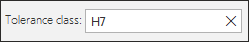
•Parameter display field, for example, the tolerance class selected for the size in a special dialog; generated view caption, etc. This field is not available for the manual input. |
|
|
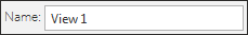
•Field for setting a text parameter, for example, the name of the view, name of the bump element, etc. The value can be edited manually. |
|
|
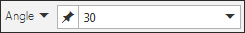
•The field for setting a numeric parameter, for example, radius, length, slope angle, etc. |
|
|
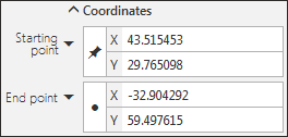
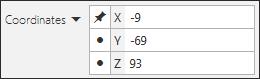
•Fields to input coordinates of the object. |


Group of elements
|
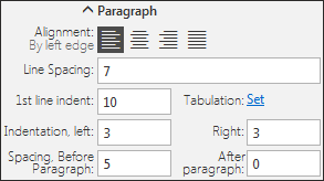
A set of various controls (fields, buttons, etc.) used to perform a specific task, for example, setting paragraph parameters (see figure) or setting coordinates for object points. By clicking on the group name you can hide/show its elements. |
Button Group
|
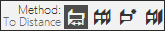
This is used in the following cases: •To choose the desired option from several possible options, for example, the choice of how to determine the bumping depth. The button of the selected option is highlighted in color, and its name is shown next to the group name. |
|
|
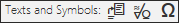
•Performing a specific action, for example, inserting a character into a text box. Clicking the button starts the process, in this case it opens the symbol selection dialog. |
|
|
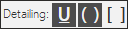
•Setting the parameters, for example, the detailing of the dimension text. You can use several group buttons at the same time. In our example, you can underline the text of the label and display the size in brackets. The selected buttons are highlighted in color. |
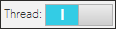
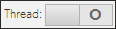
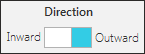
Toggle Switch
Consists of two fields allowing you to select one of two predefined values. To switch the value, click on any of the fields. There are two types of toggle switches: |
||
|
•swapping between I (enabled) and 0 (disabled), |
|
|
•selecting one of two values for parameters, e.g., Inward or Outward. |
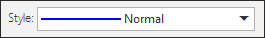
List
Allows selecting the desired parameter value. There are several types of lists: |
||
|
•List to select one value. This value is displayed in the field. If the selected value can be changed, the input in this field will be available. In this case, to expand the list click the triangle to the right of the field. If the value cannot be changed, click anywhere in the field to open the list. |
|
|
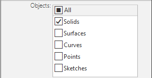
•List to select a different number of values: one, several, all, none. Selected values are ticked. |
Button
|
Allows you to perform any action, for example, change the direction of bumping, start a vector building subprocess, enable/disable display of size tolerances, etc. |
|
|
After clicking certain buttons their icons may change, for example, after clicking the button for changing the direction, the arrow on the icon changes to the opposite. |
|
|
Instead of an icon, there may be a text label on a button; for example, the button to insert the "Rotated" icon in the view caption icon type does not have an icon. Such buttons when pressed are highlighted in color. |


Variant
|
Controls execution of specific actions. When this option is enabled, the action is performed, and if it is disabled, no action is performed. |
